Overview
Dinner parties are fun. Organizing it isn't.
Cooking and sharing dishes with friends should be joyful, but the logistics get in the way. There's no central place for recipes (not everyone has access to the same cookbooks), coordinating a meetup can get hectic, and it isn't always clear how to take part. Research surfaced a telling pattern: most people just fall back on group texts. I designed a structured-but-approachable experience with clear club workflows, intuitive recipe browsing, and guided meeting setup with minimal friction from the first tap to the dinner table.
Two personas, one fragmented experience
Each captured one side of every cookbook club, and a shared set of frustrations:
Jefferson · 29
Marketing Manager · Host
Organizes dinners and volunteers to host. Needs a central place to assign who cooks what, plus shared planning for date, location, and shopping.
Susan · 34
Software Engineer · Explorer
Cooks as a hobby and saves recipes everywhere. Needs one structured library with search, and an easy way to share with friends.
- Affinity mapping spanned goals, cooking habits, pain points, social needs, content preferences, and app expectations.
- The shared frustration: recipes scattered across notes apps, screenshots, and TikTok bookmarks, with coordination living in chaotic group chats and Google Calendar.
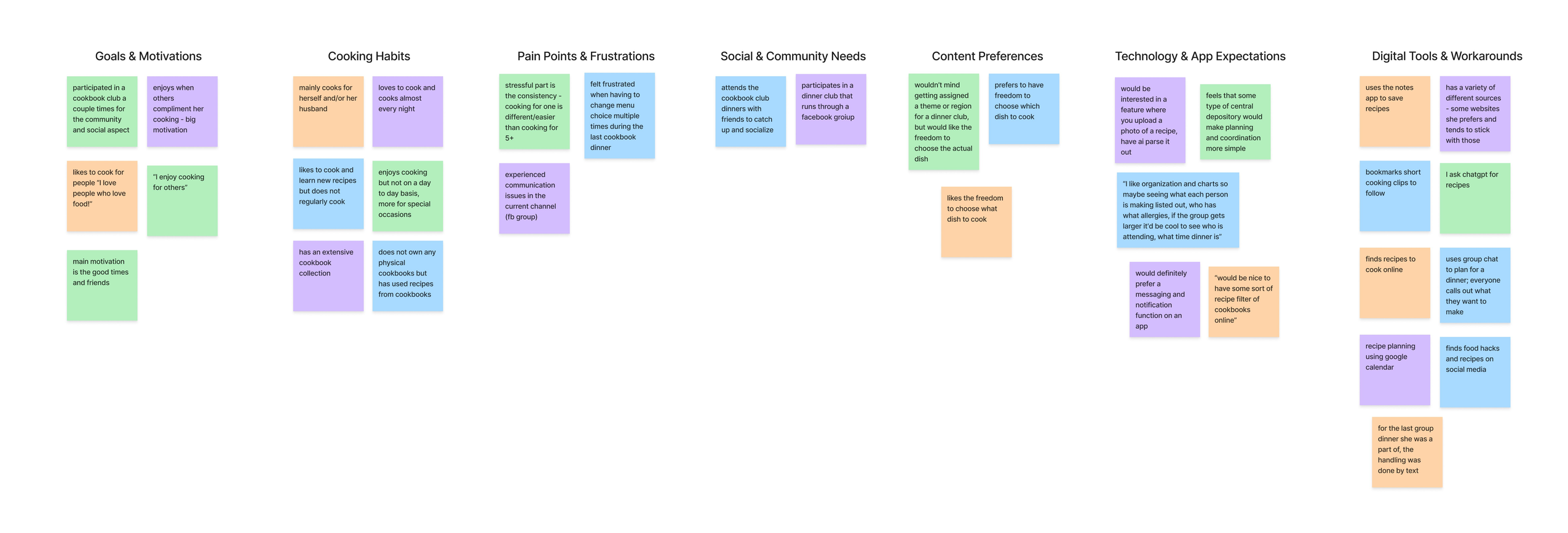
- The social pull: goals and community needs both pointed to cooking together for the people, not just the food.
- The scatter problem: recipes lived across notes apps, screenshots, and social media, with no shared home.
- The coordination gap: planning leaned on group texts and calendars, the workaround I set out to replace.
Where users and the business align
User goals
- Browse recipes from a cookbook
- Coordinate who brings which dish
- Plan dinners collaboratively
- Save recipes in one place
Business goals
- Centralize dinner planning
- Reduce reliance on group chats
- Grow via invites & shared events
- Drive repeat usage
Technical
- Real-time updates on dish claims
- Prevent duplicate selections
- Recipe import & reminders
Structured the whole product
I organized the app around five clear areas so key actions stayed discoverable as it grew.
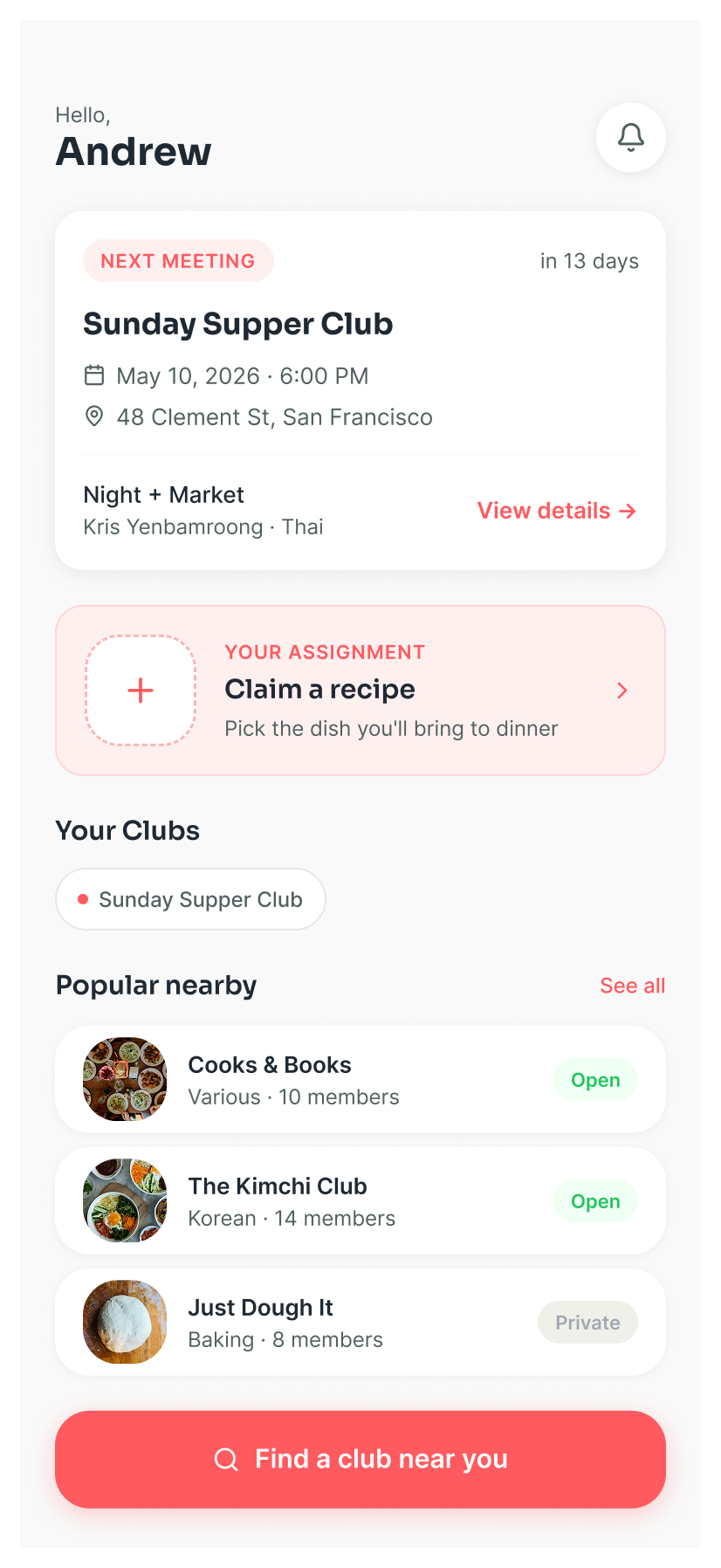
Home
- Upcoming dinners
- Recent recipes
- Club activity
Recipes
- Recipe library
- Discover cookbooks
- Saved & favorites
- Add recipe
Events
- Upcoming
- Assigned dishes
- Grocery list
- Plan new
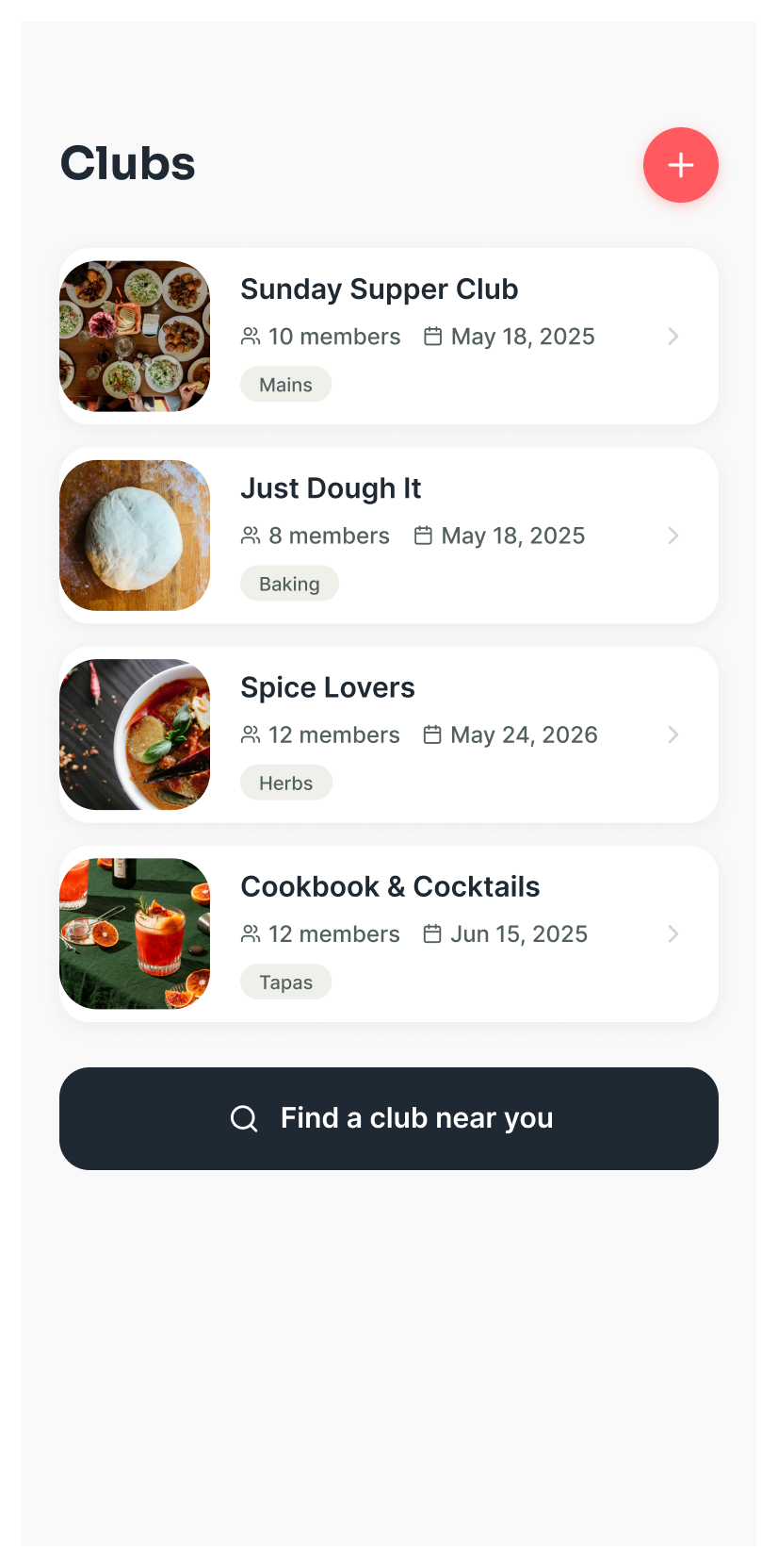
Clubs
- Members
- Club feed
- Invite
- Photos
Profile
- Account
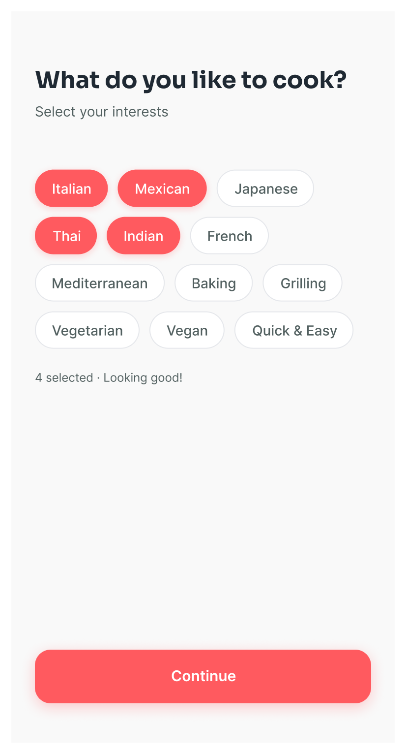
- Cooking prefs
- Previous recipes
- Settings
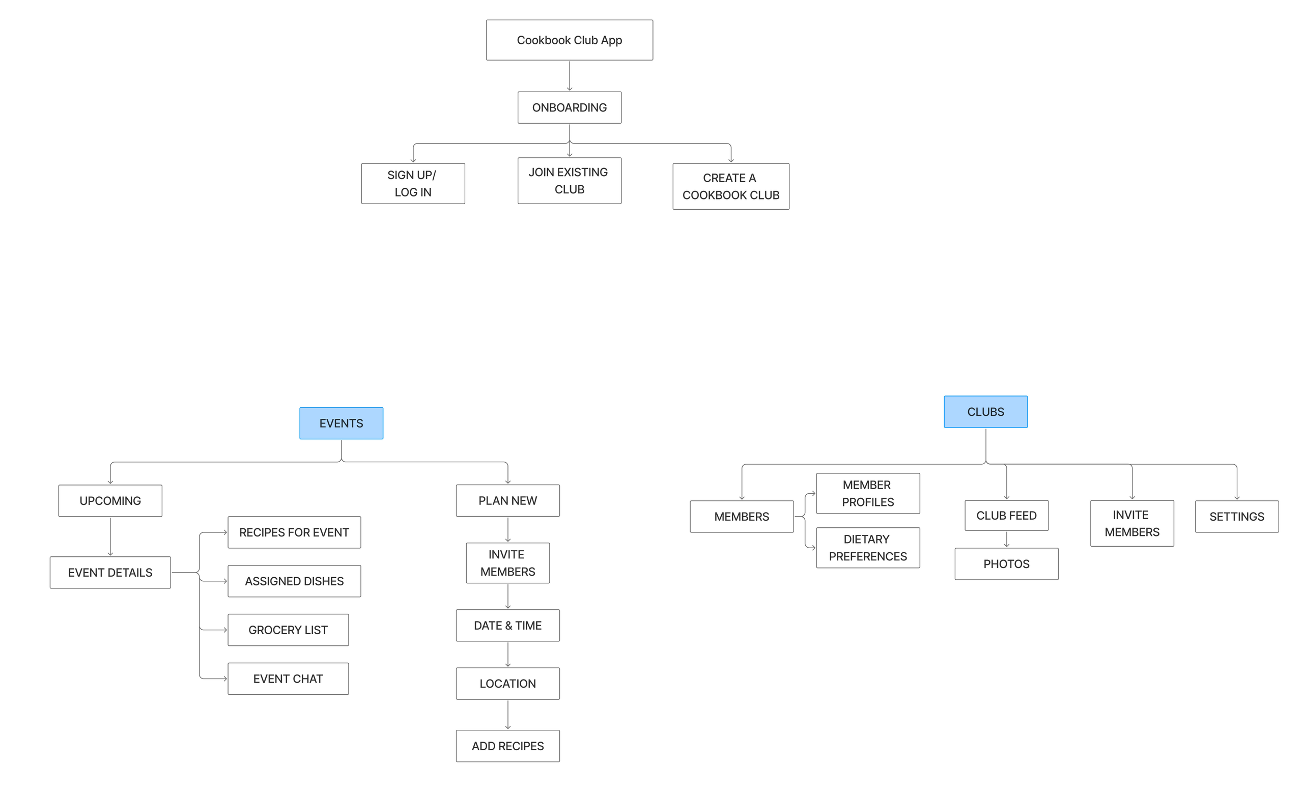
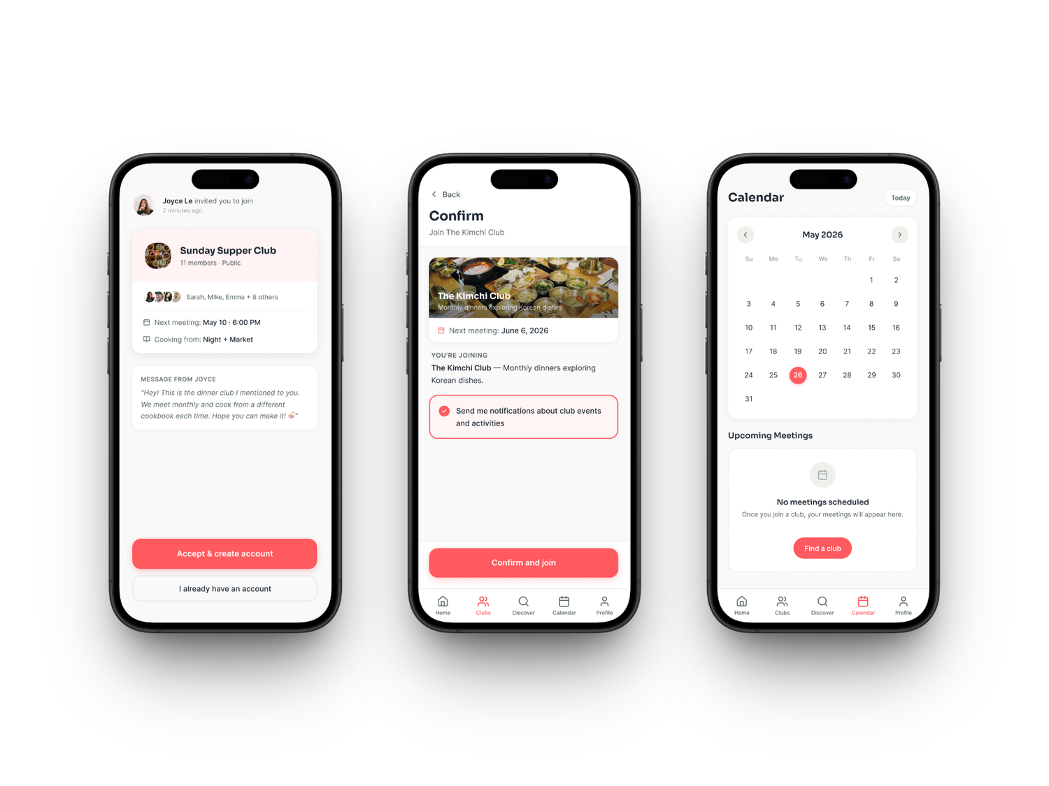
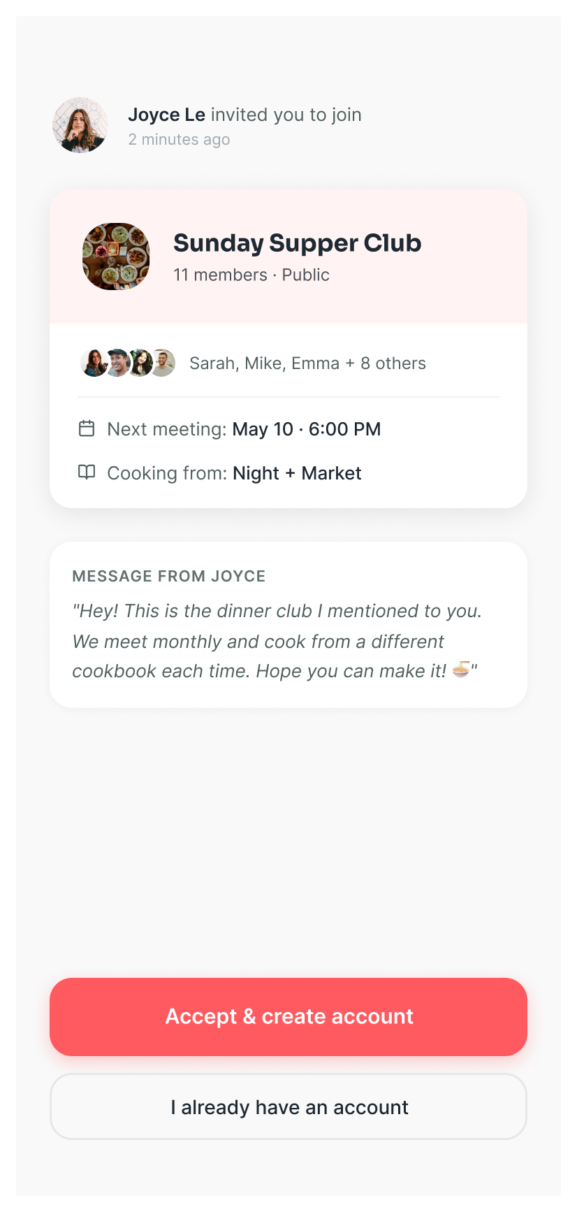
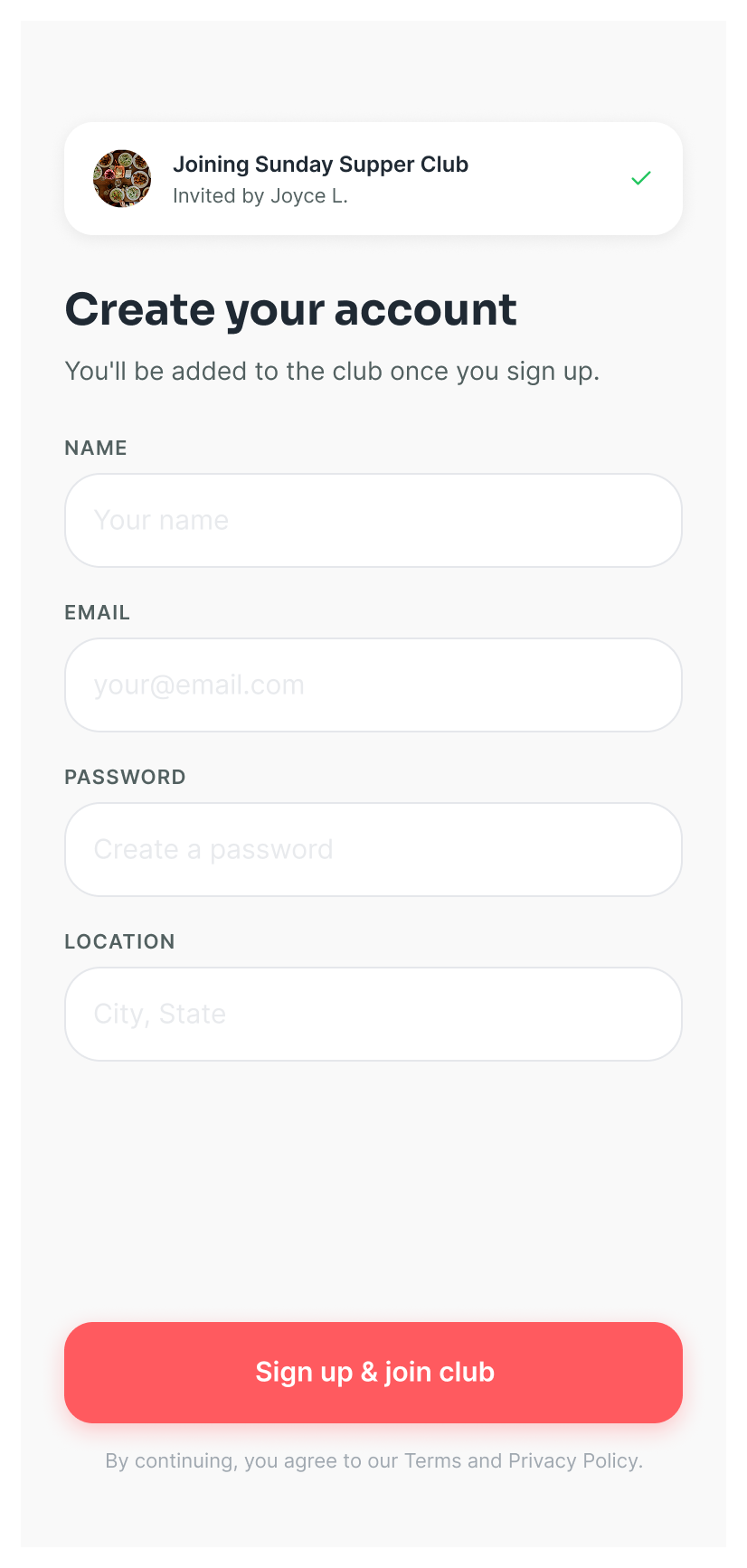
- Three onboarding paths branch off the start: sign up, join an existing club, or create one.
- Events carries the planning load, from upcoming dinners to the guided "plan new" setup (invite, date, location, recipes).
- Clubs holds the community layer: members, feed, invites, and dietary preferences.
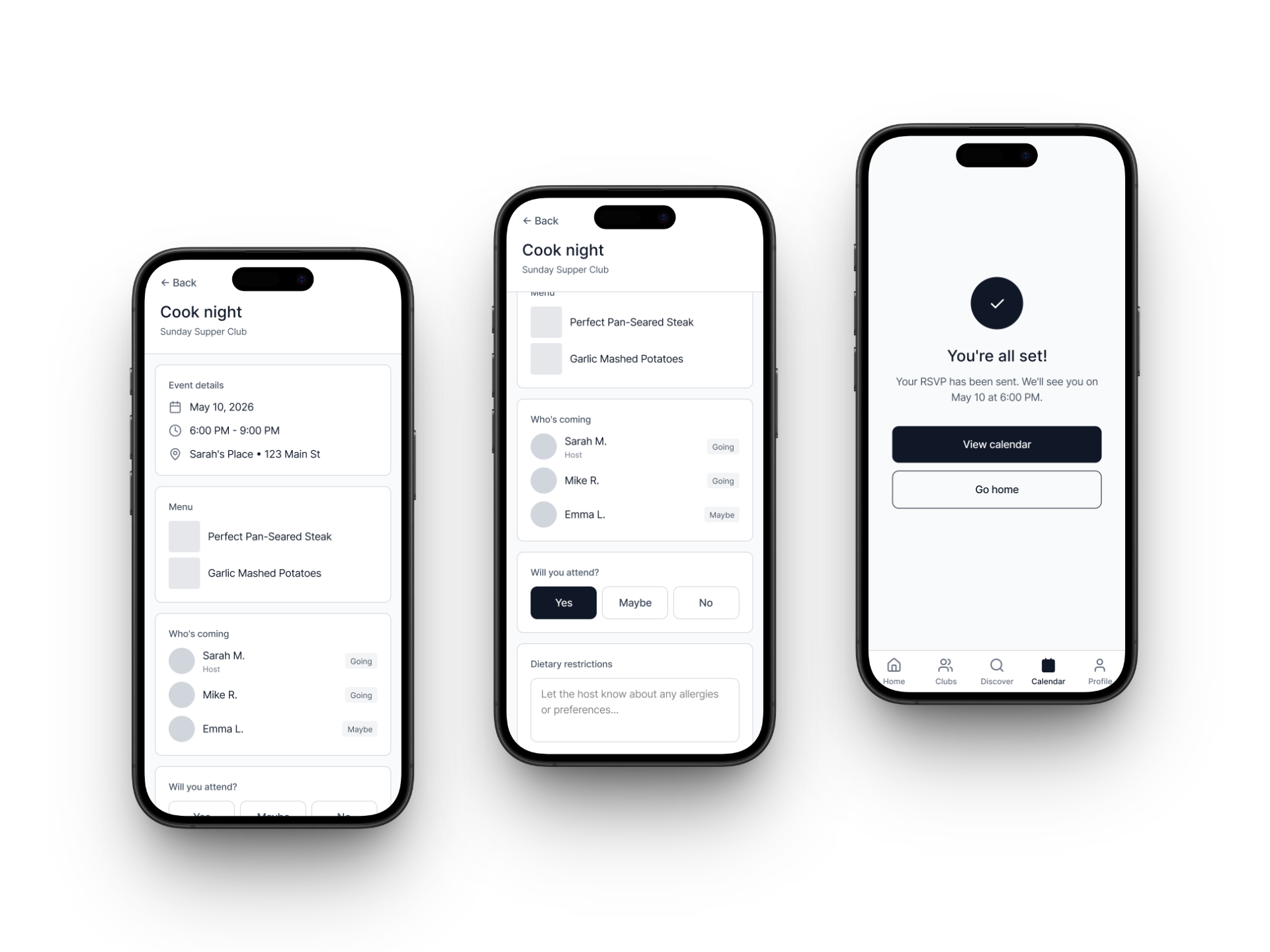
- Event details gather the essentials up top: date, time, place, and the menu people are cooking from.
- RSVP in one tap (Yes / Maybe / No) with an optional dietary-restrictions note for the host.
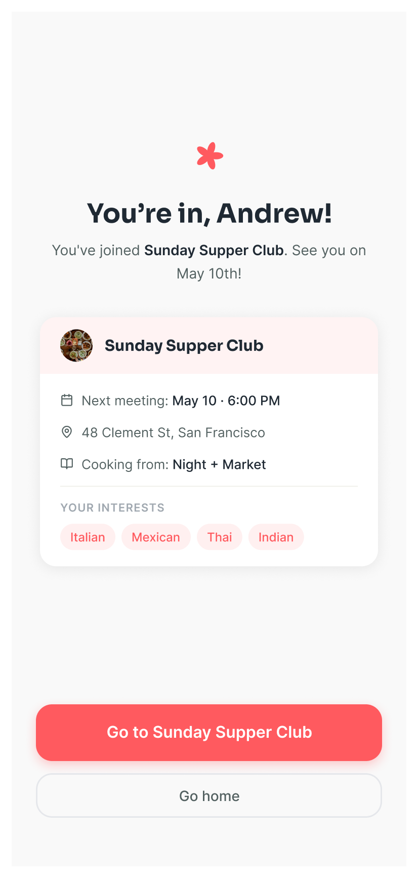
- A clear success state closes the loop and routes the member to the calendar.
Tested twice, let findings drive the design
Round 1 · Mid-fi
5 home cooks · moderated
- Flows felt intuitive; few misclicks.
- The "claimed dishes" page wasn't legible at a glance.
- Photo upload didn't feel tied to an event.
Round 2 · Hi-fi
4 participants · prototype
- Create-a-club jumped straight into a meeting, which felt misplaced.
- Users wanted to see who claimed each dish.
- No easy way back to their other clubs.
"It's like meetup.com meets a recipe app."
Usability test participantThose findings translated into direct changes: I moved meeting-creation out of the create-club flow, added member names to each claimed dish, clarified that photos post to a specific dinner, and improved navigation back to all clubs.
A single flat list of clubs. Your own clubs and ones you might join read as the same thing, so there's no clear sense of what's yours versus what's new.
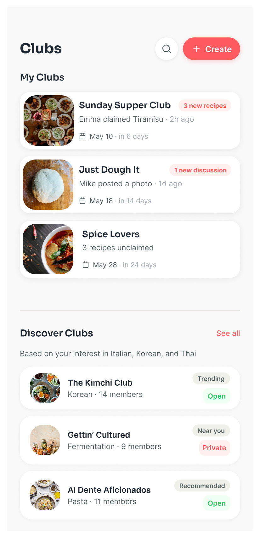
Split into "My Clubs" up top with live activity, and "Discover Clubs" below, recommended from your tastes.
Built the brand and the system
I designed a warm, approachable identity and a reusable component library so every screen felt cohesive.
- Two wordmark voices: an editorial serif for warmth and a tight all-caps sans for product confidence.
- The mark scales down cleanly to an app icon in full color, monochrome, and dark variants.
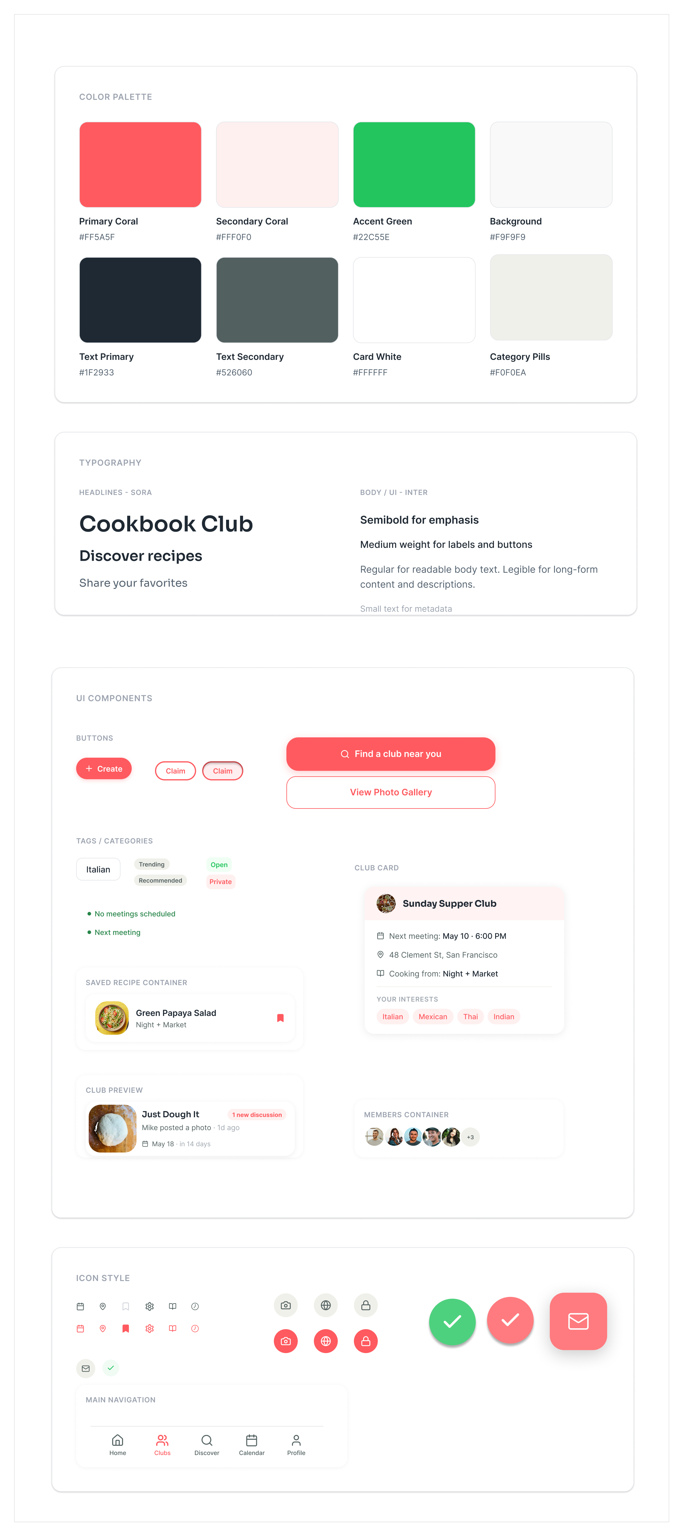
- Coral primary with a green accent for confirmations, on warm neutral surfaces.
- Sora for headlines, Inter for body and UI, with weights mapped to emphasis, labels, and metadata.
- Components are built once and reused: club cards, recipe containers, member stacks, and the tab bar.
Outcome
A user-centered platform that makes discovering cookbooks, coordinating dinners, and engaging with a community feel simple: a structured, welcoming alternative to the group chat people were settling for, with reusable components and a brand that's distinctly its own.